Itaú Payment Calendar
Project Details
Role: Product Designer
Company: Itaú Unibanco
Year: 2016
About Itaú Unibanco
Itaú Unibanco is one of the biggest banks in Latin America, it offers financial services ranging from bank accounts and credit cards, to complex brokerage investments. It was one of the first traditional banks in Brazil to go digital and is widely recognized for its digital experience.
PROBLEM
The customers of the app were asking for a place to manage their payments and transfers. Since the the app had already several payment functionalities, it was important to separate the transactional features from the user management ones.
The target audience that was facing this issue was very significant, so I needed to create a solution that could better fit multiple users profiles.
STRATEGY AND METHODOLOGY
First, it was important to make a benchmark and user interviews to understand the real problem and the best way to solve it. With the user interviews I found out that usually our users used personal planners or spreadsheets to make their financial management, their expenses were organized month by month and they usually waited to pay their bills until the day after their payment day.
With that insight, it was clear why the users didn't see the account timeline as a feature for financial management.
After that, I made a user flow and wireframes to connect the current features and the ones we were already developing, and how our solution could be better integrated, considering all the of payment types and statuses. In order to achieve that, it was important to talk with the development team to understand the technical background we had and what we needed to improve to create the proposed solution.
Once the wireframe was ready and validated, I ran some usability tests to make sure the solution was solving the main problem. The format itself was great, but the test found some problems with the terms we were using to differ the statuses and payment types, so I made another test to guaranty that the terminology was comprehensible.

OUTCOME
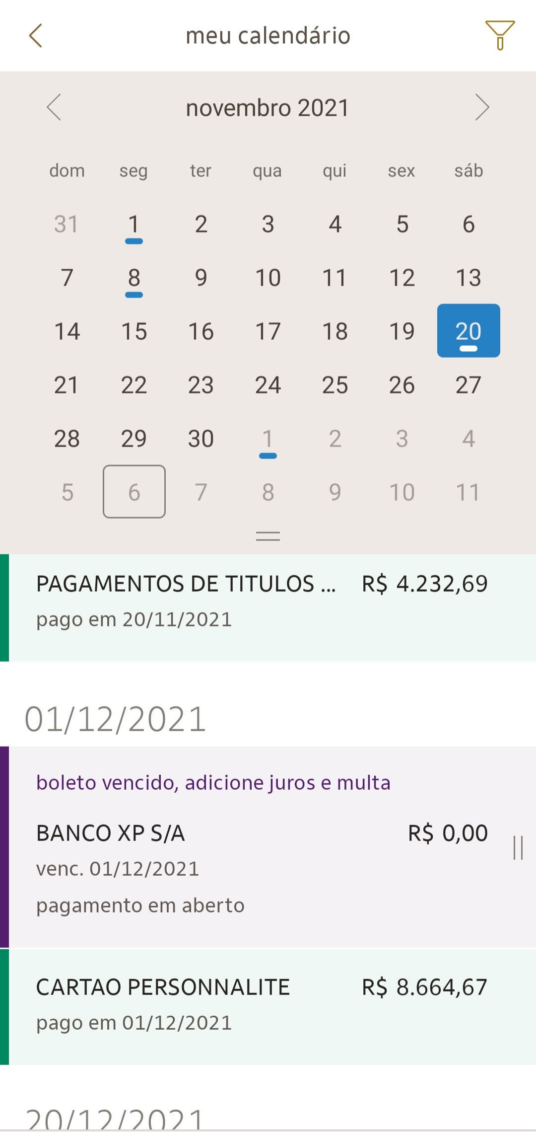
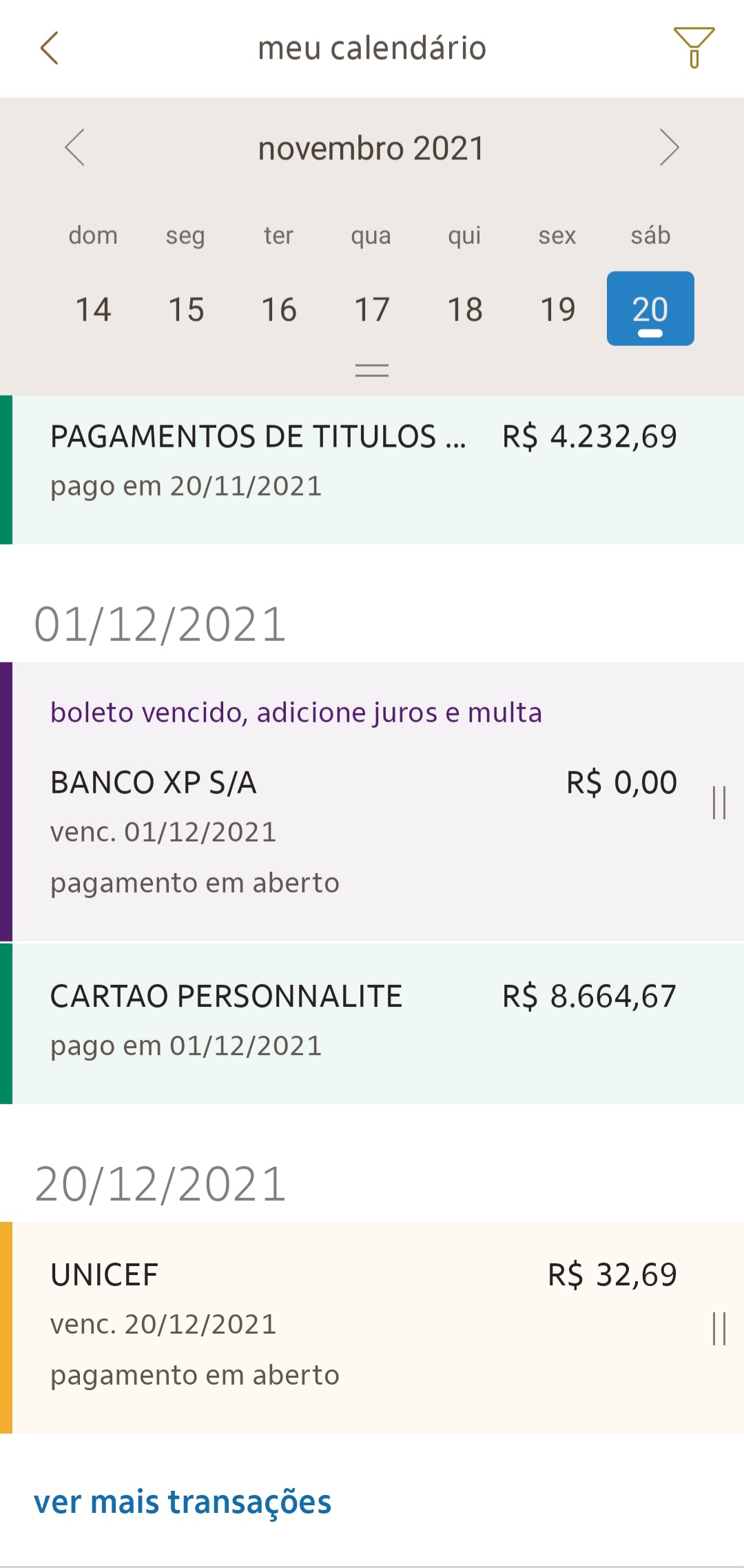
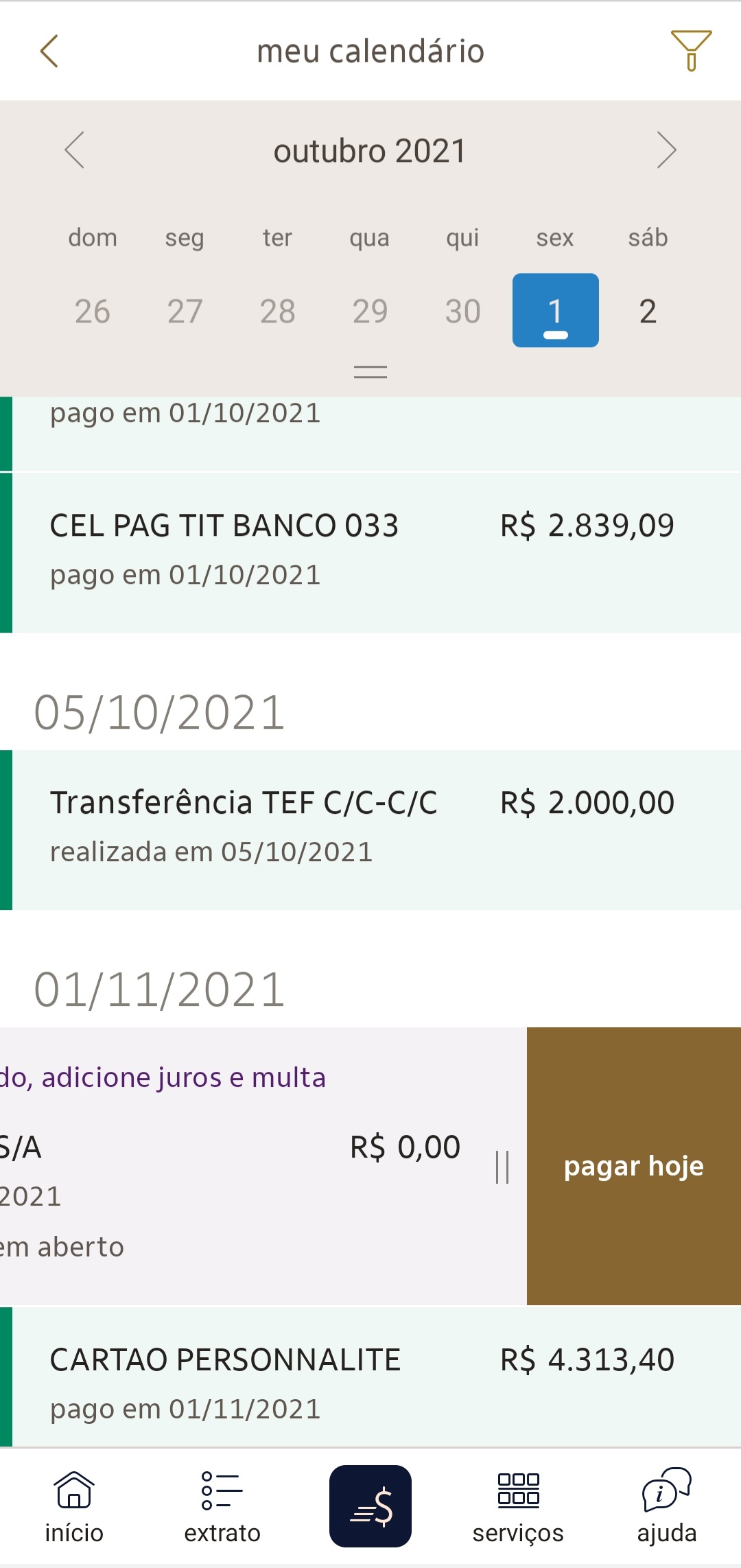
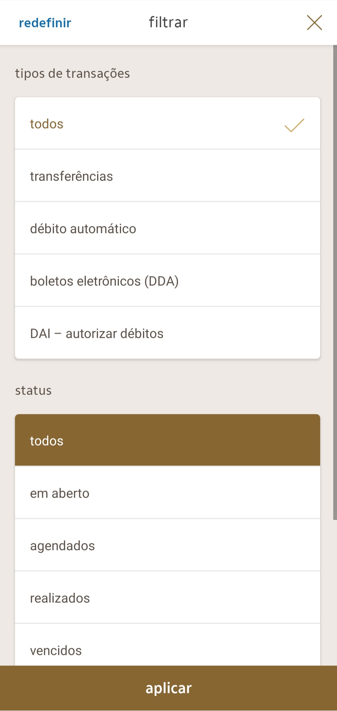
The final outcome was a calendar that lists all the payments and transfers of the user. It can be filter it by payment status, type and period of time. It also also highlights the days that the user has any payment listed.
The user can interact with the payments list by scrolling up or down and execute actions on each item that change according to the payment status, so this list also became a shortcut for the users to do everything they need to manage their payments.
Digital Acessibility
One of the biggest challenges of this project was making the solution accessible, because the experience that was designed to visual users was not the best experience for users that interact using screen reader.
The solution was to implement a filter by period of time to make it easier for all users to find a specific range of payments in the list and, for the non-visual users in particular, it was even faster to interact than the full calendar. Also, since the navigation by the mobile screen readers doesn't allow to skip the calendar at the top, it created an unnecessary step that turned the usability worse, so when the screen reader is active, the calendar disappears from the interface. This kind of modification is not always recommended by WCAG normative, but it was the non-visual users preference.
APP INTERFACES
LEARNINGS
This project showed me that users still make connections to non-digital elements to use digital solutions, in this case the use of the personal planner, and that sometimes the best innovation is on how our technology adapts to this kind of metaphor and the different ways users want to interact with it.
